Gallery

  • Emily de Molly

    No Love Lost
  • High Elbow

    Crummock Water
  • Dots!

  • Pocket Money Polishes - I Want Candy

  • Pocket Money Polishes Magic

    Gradient: Chanel Paradoxal and Dior Waterlily
  • Emily de Molly - Serenity

  • Fellrunning

    Dryburn Moor
  • Elevation Polish - Opal

  • Darling Diva Polish - Serendipity

  • Derwentwater

  • Pocket Money Polishes - Summertime

  • Nail Lacquer UK

    Eat My Cake
  • Scofflaw - Whiskey Tango Foxtrot

  • Hodge

  • Chanel - Taboo and Peridot

  • Chanel - Bel-Argus and Azure


Saturday, 9 March 2013

Butter London Fruit Machine - swatch and review


Butter London Fruit Machine

I have to admit a weakness for pastel, bubble gum pinks! They remind me of the pink sugar mice we used to make at junior school!  When I saw Butter London Fruit Machine in swatches, I thought it was very pretty, but I convinced myself there was no need to buy it as I've already got plenty pink polishes - but once I saw it in person I couldn't resist so here we are.........

Pictures are taken in natural light, but it's quite gloomy here as usual. I used two coats of Fruit Machine, a coat of Seche Vite, then another coat of Fruit Machine followed by a final coat of Seche Vite. I always use this method of application for pastel creams - it seems to avoid any streaking and give me a smooth, glassy finish every time. The Butter London Formula is great; the polish is a good consistency and the brush is small and easy to handle. Here are a couple of photographs from slightly different angles

Butter London Fruit Machine

Butter London Fruit Machine

I have several similar colours to this one, but I think Fruit Machine is lighter and brighter than anything else in my collection in this colour group, so I'm happy I bought it. I was also tempted by Kerfuffle, which was incredibly pretty in the bottle, but when I held it in my hand it seemed to clash awfully with my skin..........still thinking about that one!

I did do a comparison to two of the *nearest* pinks I pulled out of my helmer - Essie Cascade Cool and Pixi Paradise Pink (at least I think it's Paradise Pink, it's lost its label). Here are a couple of comparison pics at different angles and slightly different light conditions. Butter London Fruit Machine is definitely the lightest of the three; Essie Cascade Cool is darker and slightly more cool toned; the Pixi polish is darker but also brighter than both the others. OK, the differences are subtle, but they are different!


Here are swatches of the Essie and the Pixi, I wanted to see how they looked as a full hand. First Essie Cascade Cool

Essie Cascade Cool

Essie Cascade Cool
Essie Cascade Cool

Distinctly more lavender leaning. And the quality of the pigment is quite different to the Butter London; whilst the Butter London is dense and chalky, the Essie is sheerer and rather luminous. The application is the same as above, two coats of polish, one coat of SV, another coat of polish and a final coat of SV. Essie Cascade Cool applies nicely, like all Essies do, but this one has a massive brush! I've seen a few Essies with big brushes recently, I don't know if there is any reasoning why some colours get them. Whenever I get a polish with a huge brush, it always reminds me of a teacher I had at art school - he was always encouraging us to use a bigger brush, and honestly, it does make painting easier. With this whopping brush I was able to paint my pinkies in one stroke and my other nails in two, all very neatly, as the brush has a rounded end that seems to fit the shape of my cuticle nicely. I've seen others complaining about the big Essie brushes, but I'm all for them!

My final pink is Pixi Paradise (?) Pink

Pixi Paradise Pink

Pixi Paradise Pink
Pixi Paradise Pink

This is stronger and darker than Butter London Fruit Machine, and brighter and warmer than Essie Cascade Cool. It's a dense, chalky sort of pigment, and the formula on this one isn't as good as the other two - its a bit gloppy and has a distinct tendency to streak. I used the same application regime as before, and this time I felt that without the SV between the second and third coats the end result would have been a streaky mess.

I don't really know very much about the Pixi brand; I only own one other colour besides this one. I've had both for several years. Both times I bought on the basis of colour, and in both cases the formula was 'meh'.

Butter London Fruit Machine is part of the Spring 2013 Catwalk Pastels Collection, and is readily available. I bought my bottle at John Lewis. Essie Cascade Cool was one of the summer 2012 colours - I suspect these might have been discontinued because they are turning up in discount retailers in the UK - I've seen them in sets in TKMaxx but I bought this particular bottle on a market stall a couple of weeks ago for about £2. I bought the Pixi polish from Boots several years ago, can't remember exactly when, but my local Boots doesn't stock them any more. Pixi has a sales website.

Has anyone pale tried Butter London Kerfuffle? Does it work with your skintone?

Friday, 8 March 2013

China Glaze Hologlam Infra Red - swatches and review

China Glaze Hologlam Infra Red


I don't have much to say about this one really. It's a hot pink holo. I mean, it's a holo, its PINK.... and its HOT!

This is two coats, no basecoat, no topcoat. Application is flawless, the formula seems a bit thicker and richer than the old China Glaze OMG holos and therefore easier to handle. I don't have any similar colours to compare it too - but I guess it's probably a bit like QT from the OMG collection, which sadly I don't have.

Pictures are taken indoors, near a lamp, there's been no sun in the UK today! One one of my screens the base pink looks quite a bit warmer than in real life, on my other screen it looks just about right - which goes to show you can never trust how colours look on computer screens! Also, it's worth saying that in the bottle, this colour looks quite dark and murky, almost like a 'berry' shade and you can hardly see the holo. Don't be put off by this if you're looking at the polish in a bricks and mortar store - this is one that really comes to life on the nail.

Spamarama at different angles....................

China Glaze Hologlam Infra Red

China Glaze Hologlam Infra Red

China Glaze Hologlam Infra Red

China Glaze Hologlam Infra Red

China Glaze Hologlam Infra Red

I purchased China Glaze Infra Red from Faith Cosmetics on amazon.co.uk. That's a great seller, I ordered yesterday, and got the polish this morning; postage was just £1.

I also reviewed When Stars Collide from the China Glaze Collection recently, which is a lovely deep plummy colour. And I can't believe how much my nails have grown in the few weeks since that post! I'm much happier with them a bit longer :)

Thursday, 7 March 2013

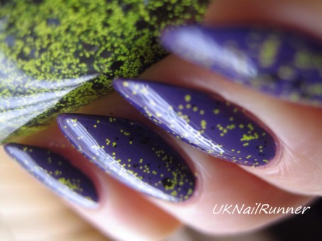
Nail Venturous Humble Bee over Rescue Beauty Lounge Mismas

Let's start with a picture of the finished mani :)

Nail Venturous Humble Bee Rescue Beauty Lounge Mismas
Nail Venturous Humble Bee over Rescue Beauty Lounge Mismas

Rescue Beauty Lounge Mismas is a fabulous polish, a true violet-purple which applies beautifully in just one coat. Here it is on it's own, but it's the devil itself to get a colour-accurate photograph. When I photographed in natural light, it came out royal blue! The first two pics below are shot in natural light and I've manipulated the colour balance to make them as realistic as I can. The second two pics are shot near a window, but with an incandescent lamp off to one side. I think these are closer to the true colour, maybe a bit reddish - but please don't use my pictures as accurate colour swatches if you are thinking of buying Mismas!

Rescue Beauty Lounge Mismas

Rescue Beauty Lounge Mismas

Rescue Beauty Lounge Mismas

Rescue Beauty Lounge Mismas

This is one coat of Mismas, with a coat of Seche Vite.

Then I added a very light coat of Nail Venturous Humble Bee. Humble Bee is a mixture of tiny neon yellow and black matt glitters with a sprinkle of medium sized black hexes. This glitter is on the dense side - in fact it's a glitter you can achieve full coverage with very easily, but I was aiming for a rather different effect here. Very light brushing was needed; I wiped most of the polish off the brush onto the neck of the bottle for each nail before I applied it. Even with this very light coat, Humble Bee is still hungry and I needed two coats of Gelous and a coat of Seche Vite to get this glassy smooth.

Nail Venturous Humble Bee Rescue Beauty Lounge Mismas

Nail Venturous Humble Bee Rescue Beauty Lounge Mismas

Nail Venturous Humble Bee Rescue Beauty Lounge Mismas

Nail Venturous Humble Bee Rescue Beauty Lounge Mismas
Nail Venturous Humble Bee over Rescue Beauty Lounge Mismas

These pictures were taken in natural light - my camera seems able to handle the purple in Mismas a lot better in combination with the yellow glitter!

Now I'm going to put on my colour geek hat on and talk about why I chose this base for Humble Bee and why I think the colours work together well. I actually got a real life compliment on this mani today from a stranger - that's a rare thing in my part of the world! If you look up swatches for Humble Bee on Google, most of the results show it used alone as a full coverage glitter or over black, with a few examples over neon yellow or green. Although I have worn it like this, I think it has a lot more potential!

I'm interested in colour and colour relationships in some other contexts besides my nails - textile arts and botanical illustration - so I always think a bit about colour theory a bit when I'm putting a layered mani together.  Colormatters is a great site that explains the basics of colour theory, and a Colour Wheel is a really useful tool for testing combinations. I keep one on my desk and refer to it for colour combining in all sorts of situations! For this mani, I wanted something that really makes Humble Bee pop, and answer to that using colour theory is to use the complementary colour of the yellow - the complementary colour is the one directly opposite on the colour wheel; in the case of yellow that is violet - hence my choice of Mismas. If we're going to get really nerdy, then the yellow of Humble Bee leans a bit towards green, so to get a true complementary (ie direct opposite on the colour wheel) you need to take a slightly warmer (reddish) violet.

Here's another mani I did with Humble Bee last year, again over a violet (Revlon Facets of Fuchsia). This was a layering attempt to create a similar effect to one of more unattainable lemmings, Alta Costura Vernis Electric Eyes imfeelingnail-venturous post and pictures of this lovely polish

Nail Venturous Humble Bee Revlon Facets of Fuchsia
Nail Venturous Humble Bee over Revlon Facets of Fuchsia

With this combination you lose some of the complexity of Humble Bee, because the black glitters just blend into the base of Facets of Fuchsia, but I still really enjoyed the combination of violet and yellow against the black base!

I purchased Nail Venturous Humble Bee from Ninja Polish - it's now rebranded as Ninjapolish Humble Bee Floam and is in a different shaped bottle, but the polish is the same. My Rescue Beauty Lounge Mismas came in a swap, but you can buy it direct from the maker RBL Mismas. Revlon Facets of Fuchsia is available at Boots and other drugstores around the world - I believe the colour was renamed 'Scandalous' in some countries a little while ago.

Thank you for reading!