


Hmm, I wasn't planning this as my *Ugliest* untried (I had in mind a polish the looks like the colour of cat food for this) but I'm so horrified by it's nastiness I just have to!

I bought this in Boots when it came out a couple of months ago. There were four colours in the Polka Dots series - this dark blue, a murky looking jade green, a dirty pink and a black and white glitter topper in clear base. I really love black and white glitter - Lynnderella Connect the Dots was my biggest lemming for weeks when Lynn and the whole indie thing started (that'll only be about two years ago but it seems like forever) and I was over the moon when I got my bottle. I've accumulated a nice collection of black and white indie glitters in various shapes, sizes and quirks since then. Shooting Stars was the only one of the Maybelline Polka Dots that appealed to me; I didn't need another black and white topper and I didn't like the other colours. I did think it looked promising though............
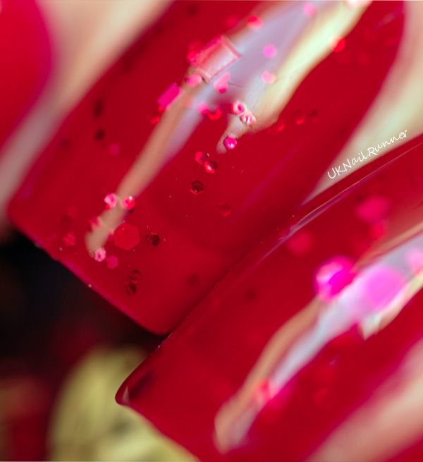
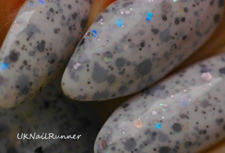
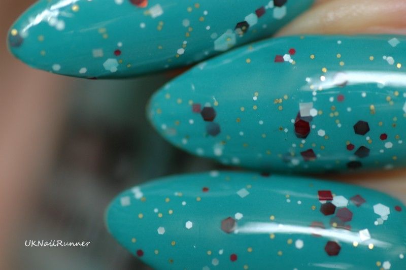
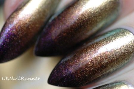
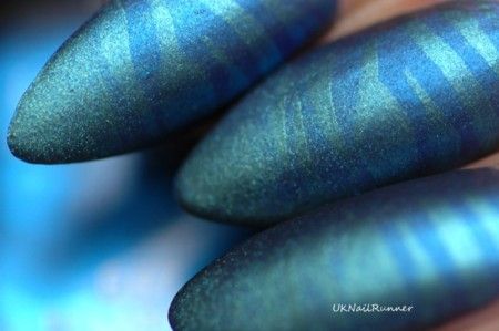
It's HORRIBLE! Everything about it is wrong! The base is too dark, so it almost covers up the black glitter, and pools and blobs over the white glitter. making the bigger white glitters look all uneven and streaky. The base is also too thin and watery to suspend the glitters properly when you apply it to your nail (you know how the bases on good glitter indies are thick and jelly-ish - well this is just the opposite!) so it dries rough and streaky, with the glitter sticking up like sandpaper. Look at it on my thumbnail:

I layered this over an existing blue mani (Chanel Blue Boy); I can imagine the streaky mess it would be if I'd tried to use it on it's own!
Of course, if you put enough topcoat on and take pictures from the right angles you can make anything look reasonable in pictures, lol!


But in real life this polish is rather nasty and I wouldn't recommend anybody buying it! I purchased it at my local Boots, for the record. And I used two coats over a blue base and added two coats of Gelous and a coat of Seche Vite on top.
Other bloggers taking part in this untried challenge are:
Jonochi at Just Add Polish
Masha at Lost In Lacquer
Raine at Lacquer Lily
Amy at Fancy Side
Amanda at Designer Nail Accents
Sam at Polished Art
Lizajane at Organic Neglect
Blueberry Pie at Blueberry Nails
Kristina at Lacquer Fetish
Jonochi at Just Add Polish
Masha at Lost In Lacquer
Raine at Lacquer Lily
Amy at Fancy Side
Amanda at Designer Nail Accents
Sam at Polished Art
Lizajane at Organic Neglect
Blueberry Pie at Blueberry Nails
Kristina at Lacquer Fetish
I agree! This color would be gorgeous if the base wasn't so dark.
ReplyDeleteOh noooo. I was just thinking of getting this one too. I think I might have to avoid it now and save my money for something better. You still rock it and make it look really nice though. I am pretty sure you can make anything look awesome!
ReplyDeleteI have the green, but haven't used it yet. Maybe it's because I suspect it will have all the drawbacks you've highlighted with the blue! I appreciate your honesty as you have made it look rather pretty in your photos!
ReplyDeleteThat's weird - I have the whole set, and I really like them! Especially the green.
ReplyDelete